Wedding colour palette: how to choose one, and 8 palettes for 2027
How to pick wedding colours that suit your venue, season and light in Poland: the colour wheel, the 60-30-10 rule and 8 palettes with HEX codes, shown in one hall.
Published 20 min read
Contents
The wedding's colours (in Polish kolor przewodni, the "leading colour") are a decision everyone comes back to: the florist, the decorator, the stationery printer, the bakery, even the maid of honour choosing her dress. It's best made about a year before the wedding, right after booking the venue, because the venue decides which colours will hold up in it. It isn't the same as a theme: a theme (rustic, glamour, boho) is the style, the colours are what you dress it in.
This guide goes through it in order: the venue's own colours, the colour wheel, proportions, light, photos, flowers in season and costs, with a comparison of 8 palettes in the same hall in the middle. It's written for couples marrying in Poland, so the prices are in złoty and some sources are in Polish.
Start with the venue: its colours are already in your palette
The venue is the largest surface at the wedding. Its walls, floor, ceiling, curtains, chairs and chandeliers stay whatever you choose, so the palette starts from them. A couple who dream of butter yellow and blues and then book a hall upholstered in maroon will fight it all evening. Instead, take one colour from the room (its wood, brick or walls) and repeat it in the details: the decorations then look like part of the place rather than something brought into it.
| Kind of venue | Colours already there | What goes with them |
|---|---|---|
| Hotel or restaurant hall | Usually neutral: white, cream, beige | Almost any palette; the colour comes from linen and flowers |
| Manor house (dworek) | Wood, white, parquet | Greens, pastels, terracotta |
| Palace (pałac) | Gold, cream, crystal chandeliers, marble | Deep colours and white. No need to add gold to a gilded room: contrast with it |
| Barn (stodoła) | Warm wood in the planks and beams | Earth colours and green, with light linen on the tables so they don't merge into the walls |
| Loft | Red brick, black steel, big windows | Bottle green, mocha, terracotta, black and white |
| Tent | White | Any palette. In the evening, the lighting you order decides |
The venue also brings the linen. Most Polish offers include white or cream tablecloths and napkins in the price per plate, often white chair covers and white candles too, as at Zamek Lubliniec, Pod Kominem or Pałac i Folwark Łochów. Coloured tablecloths and covers usually cost extra (we add it up below). The white in the price per plate is your 60% base, and the easiest place to start.
The colour wheel in brief
Every colour has three properties:
- hue, the colour family: red, green, blue;
- saturation: how pure or muted it is (dusty pink is pink with low saturation);
- lightness: how light or dark it is (navy and pale blue share a hue but not a lightness).
On top of that comes temperature: yellow through red are warm, yellow-green through violet cool. The colour wheel lays colours out in order, and how far apart two colours sit tells you how they'll behave together:
| Scheme | What it is | How it feels | Watch out for | Example from the palettes below |
|---|---|---|---|---|
| Monochromatic | One hue in several lightnesses | Calm and elegant | Flat without differences in lightness and texture | Dusty blue; mocha; bottle green |
| Analogous | Neighbours on the wheel | Harmonious, warm or fresh | Muddy when every colour is mid-light | Sage; terracotta; burgundy with plum |
| Complementary | Two colours opposite each other | Contrast and energy | Loud at full saturation; red with green reads as Christmas | Navy and peach |
| Split-complementary | A colour and the two neighbours of its opposite | Softer contrast than complementary | Easy to overdo the number of colours | Lavender with yellow and green |
| Triadic | Three colours 120° apart | Cheerful and colourful | In pure hues it looks like a child's birthday | Rarely works at a wedding |
Lightness matters more than hue. Two colours of the same lightness merge into one patch even when their hues are far apart. A palette holds together when it has something light, something medium and something dark. That matters most in the evening, when colours look less saturated in dim light and the room is carried mostly by differences in lightness.
The 60-30-10 rule: how much of each colour
It's a rule from interior design: 60% of the space in the base colour, 30% in the second colour and 10% in the accent. Nobody knows exactly where it came from and it's no law of nature, but it keeps a room from having equal amounts of everything. At a wedding:
- 60%, the base: the room, the tablecloths, the chair covers, the curtains. Often the white included in the price per plate.
- 30%, the second colour: flowers and greenery, napkins, runners, bridesmaids' dresses.
- 10%, the accent: candles, ribbons, place cards, invitations, small flowers in the bouquets.
- A metal on top: cutlery, candle holders, charger plates, frames. Pick one main metal, for about 70% of the metal things, and a second one as a touch at most.
The accent works despite its small area because light, saturated colours catch the eye more than dark ones. That's why a little yellow or peach goes a long way, while navy or burgundy can take more room before the hall gets heavy.
Metals have a temperature too. Gold, brass and copper are warm; silver and chrome cool. Silver suits cool palettes and a white dress, gold suits creams and an ivory dress. In a palace already full of gold, don't add more to the tables: go for contrast. The Knot's 2027 trend report notes silver coming back.
White isn't one colour. Snow-white flowers next to an ivory dress make the dress look yellowish. Snow-white polyester tablecloths can contain optical brighteners that glow blue in a camera flash. Keep warm whites with warm whites, and compare the cake's white with the tablecloth before you order it.
Light: the colours your guests will see in the evening
Colours are usually chosen by day, and a wedding goes on through the night. In Warsaw the sun sets at about 21:01 at the latest (late June), at 17:41 in mid-October and at 15:44 in mid-November. Polish receptions go on until three or four in the morning, so even in June most of the party happens under artificial light.
Light has a colour temperature, measured in kelvin. The lower the number, the warmer and more orange the light:
| Light source | Colour temperature |
|---|---|
| Candle flame | about 1,900 K |
| Ordinary bulb | 2,700 K |
| Warm LED bulb, halogen | 3,000 K |
| Midday sun | about 5,500 K |
| The photographer's flash | 5,500–6,000 K |
| Overcast sky | 6,500–7,500 K |
Warm light (3,500 K or less) brings out reds and oranges and dulls cool colours. What that means for a palette:
- dusty blue, greys and lavender turn grey, and lavender can go pinkish or flat;
- burgundy, gold, terracotta and browns deepen, although very dark burgundy can look almost black in a dimmed room;
- white turns creamy, but the eye adjusts quickly: the trouble starts when two different whites stand side by side.
See it in the palette comparison: switch the view to Evening. There's also an effect that's easy to miss in a fabric shop: two fabrics that match exactly by day can drift apart under bulbs. So look at samples in both lights.
To do: look at the fabric and flower samples in the venue at the hour of the reception: once by the window, once with the chandeliers on. Take a photo of them on your phone, without the flash.
Colours in photos
Your photographer will see the palette differently from your guests. Three things worth asking them about:
- Large saturated surfaces reflect colour onto faces. A bright green backdrop behind the couple's table gives greenish skin, deep red warms the shadows. A slight tint can be fixed in editing, a face lit only by coloured LED can't: some colours are simply missing from that light.
- Pure red and neon colours lose detail in photos, and bright orange comes out oversaturated. Muted versions (dusty blue, sage, terracotta, dusty pink, champagne) photograph well.
- A white dress and a charcoal suit are the two ends of the scale. A photographer exposing for the suit easily blows out the dress. An ivory dress or a lighter suit makes it easier.
Photographers disagree on which uplighting colours look best, but they agree on one thing: don't shine green, yellow or red towards faces.
8 palettes in the same hall
Every palette is shown in the same hall: a manor house with white walls, an oak parquet floor and round tables for ten. Pick a palette and a time of day, and below the picture you'll find its colours with HEX codes and roles, the proportions, the months and flowers in season, and whether its darkest colour works for the lettering on your invitations.
One hall in 8 colour palettes
Pick a palette and a time of day. Below the picture are its colours with codes, the proportions, the season and whether it works for lettering.
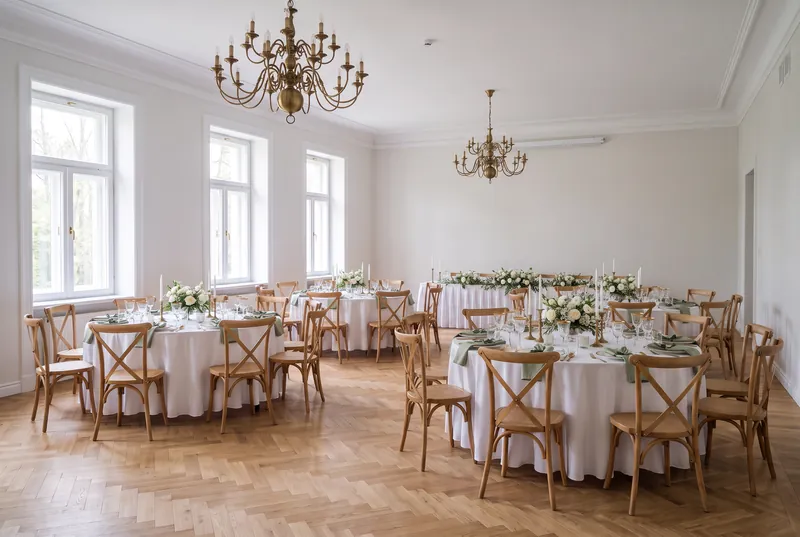
White and sage
Proportions
Base 60% · Second colour 30% · Accent 10% · Metal
- Cloud DancerBase 60% · tablecloths and napkins
- SageSecond colour 30% · napkins and greenery on the tables
- EucalyptusAccent 10% · leaves and ribbons
- BrassMetal · cutlery and candle holders
On the colour wheel
Analogous
Neighbours on the colour wheel.
- Best in
- May–September
- Suits
- Manor house, barn, garden
- Flowers in season
- Peonies (May–June), garden roses, lisianthus, gypsophila, eucalyptus
- Watch out for
- One green looks flat: mix two or three shades, and write in the dark eucalyptus or in graphite.
Lettering
Contrast 4.0:1: large letters only. For small text, use a darker colour.
The colours with HEX codes and roles, to paste into your email to the florist or decorator.
White and sage
The safest palette, at home in a manor, a barn or a garden: off-white, sage, the deeper green of eucalyptus and brass. The base is Cloud Dancer, Pantone's colour of 2026 (PANTONE 11-4201), the first white ever chosen. The greens are neighbours on the colour wheel, so it's hard to get wrong. In Zola's US survey, 53% of couples marrying in 2026 chose green and 30% sage itself. Best from May to September, with peonies (May and June), garden roses, lisianthus, gypsophila and eucalyptus, which is available all year. Sage is too light for lettering: on the invitations write in the dark green, in large letters only, or in graphite. See it in the hall.
Dusty blue and silver
One hue in three lightnesses: white, dusty blue and slate, with silver. The Knot lists powdery blues and silver among the trends for 2027. A summer palette, June to September, when hydrangeas and delphiniums bloom. It loses the most in the evening: under warm light the blue turns grey, so stay with silver (gold warms it even more) and the darker slate in the accents. The slate also works for lettering. See it in the hall.
Lavender and butter yellow
Lavender with the two neighbours of its opposite: butter yellow and a soft leaf green. That's a split-complementary scheme, livelier than lavender alone and gentler than lavender with pure yellow. A palette for June and July, with lavender, sweet peas, lisianthus and chamomile. Mind the evening: lilac turns grey in warm light, and the yellow brings it back to life. None of its colours works for lettering, so pick a separate dark colour for the invitations, such as graphite or a dark plum. See it in the hall.
Navy and peach
Complementary colours, almost opposite each other on the wheel: cool, dark navy and warm peach with apricot, plus gold. It works by proportion: more of the dark navy (napkins, the runner on the couple's table), less of the light peach (the flowers). The other way round it would shout. July to September, when dahlias and garden roses come in peach. Navy on white is the most legible lettering of all the palettes. See it in the hall.
Terracotta, rust and olive
Warm neighbours on the wheel: sand, terracotta, rust and olive, with copper. For a barn in September, with dahlias, rudbeckias, orange roses and dried grasses. Terracotta practically glows in warm light. On wooden tables and against wooden walls, choose light sand-coloured linen so the tables don't merge into the room. Rust works for lettering, but only large. See it in the hall.
Burgundy, plum and dusty pink
Deep red, plum and dusty pink with gold: a palette for a palace and for autumn, September to December. Right on trend: The Knot puts "sophisticated colours", merlot and plum, first among its trends for 2027, and Pinterest searches for a plum theme grew 630% in a year. Flowers: burgundy dahlias until October, chrysanthemums, and amaryllis from November. Dark colours swallow light, so plan more candles, and don't hang burgundy fabric right behind the couple's table: it will warm faces in the photos. See it in the hall.
Mocha, caramel and cream
One family of browns in several lightnesses, with Mocha Mousse, Pantone's colour of 2025 (PANTONE 17-1230). For September, October and November, in a loft or a manor, with coffee-coloured roses, chrysanthemums and dried grasses. A palette like this needs differences in lightness: without dark chocolate in the accents everything melts into one beige. The chocolate, in turn, works for lettering. See it in the hall.
Bottle green and gold
A dark, rich green, ivory and gold: the classic winter wedding, December to February, with white amaryllis, hellebores, anemones and fir sprigs. The big difference in lightness between the green and the white keeps the hall elegant in the evening too. Careful with red details: green with red and fir turns festive, which is lovely in December and odd in June. The green works for lettering. See it in the hall.
Flowers in season: the colours each month brings
Flowers in season are fresher and cheaper. Out of season they come from greenhouses or imports and cost more, in winter also because greenhouses are heated and lit. So the simplest way is to match the palette to what blooms in your wedding month (Polish florists' calendars):
| Month | In season in Poland | In which colours |
|---|---|---|
| January–February | Amaryllis, hellebores, anemones, ranunculus, tulips | White, cream, red, burgundy, purple, dusty pink |
| March–April | Tulips, daffodils, hyacinths, freesias, ranunculus, lilac, stocks | Yellow, pink, purple, white, blue, salmon |
| May | Peonies, lily of the valley, garden roses, snapdragons | White, pink, coral, burgundy |
| June | Peonies, hydrangeas, sweet peas, lavender, lisianthus | Pastels, blue, purple, peach |
| July | Sunflowers, cosmos, zinnias, sweet peas, the first dahlias | Every colour |
| August–September | Dahlias, asters, rudbeckias, heather, sunflowers | Burgundy, coral, peach, fuchsia, rust |
| October | Dahlias, chrysanthemums, hydrangeas (dried too), amaranthus, grasses | Copper, caramel, brick, plum |
| November–December | Chrysanthemums, amaryllis, holly, fir and spruce sprigs | Red, white, green, silver |
Roses, lisianthus, carnations, alstroemeria, gypsophila, freesias, orchids and callas are available all year from greenhouses and imports. Truly blue flowers are few (hydrangeas, delphiniums, grape hyacinths), and black or neon ones don't exist: ask for those colours in fabric, not in bouquets.
Summer and early autumn are the busiest: 45% of all marriages in Poland in 2025 took place in July, August and September. Most of the palettes in our comparison suit those dates.
How to brief the florist and the decorator
- Turn the moodboard into a palette: 2–3 colours, a white and a metal. Tools such as Adobe Color pull colours out of a photo along with their HEX codes.
- A HEX code is a screen colour. A screen emits light and fabric reflects it, so the same code looks different on different materials: darker on velvet than on chiffon. For fabrics, ask the decorator for physical samples; if someone sews or dyes to order, give them a Pantone TCX code (swatches dyed on cotton).
- Give the florist a fabric sample, such as a napkin: it's the most precise reference. Talk in colour families ("peach and apricot"), not one exact shade: every flower is a little different.
- Ask for a trial table. At the menu tasting, ask the venue whether they'll lay one table with your linen, napkins and candles, and look at it in the evening light too.
- Make the invitation the reference. Digital print, letterpress and gold foil render the same colour differently, so show the printed invitation to every supplier as the reference.
- Repeat the colours in several places: napkins, runners, flowers, candles, place cards, the seating plan, the cake, bridesmaids' dresses, ties and pocket squares. Bridesmaids in the wedding colours came to Poland from the UK and the US and aren't a must. Guests, as always, leave white and ecru to the bride.
In the palette comparison, Copy the palette copies its colours with their codes and roles: paste them into your email to the florist.
Lettering in your wedding colours: invitations and the seating plan
Colours that look lovely in flowers often fail as lettering. The measure is contrast, worked out as in the web's accessibility guidelines (WCAG): text needs at least 4.5:1, large letters 3:1. Sage on the off-white Cloud Dancer has 2.0:1, dusty blue on white 2.3:1, gold on white 2.2:1. Navy on white has 12.4:1. The palette comparison shows it for each of them.
Legibility matters most on the seating plan:
- it's read in the evening, in dim light, where contrast is harder to see;
- about 8% of men and 0.4% of women of European descent tell red from green less well; at a wedding with 50 men that's 4 people on average. So never mark tables by colour alone: add numbers or names;
- avoid red–green and yellow–purple pairs, and yellow lettering on white;
- gold foil changes contrast with the angle you look at it from: it's no good for small text.
What colour costs
Colour isn't only taste: it's a line in the budget. White is usually included in the price per plate, and colour often costs extra. There are exceptions: some venues include coloured tablecloths or chair sashes in colours to choose from, and others charge even for white chair covers. Typical extras for colour, for 100 guests at 10 round tables:
| Item | Price | 100 guests, 10 tables |
|---|---|---|
| Chair covers, when not included | 5–9 zł each | 500–900 zł |
| Coloured tablecloths from a rental | 61–69 zł each | 610–690 zł |
| Runners | 19 zł each | 190 zł |
| Low flower arrangements | 120–200 zł a table | 1,200–2,000 zł |
| Flowers on the couple's table | 350–700 zł | 350–700 zł |
| Total | 2,850–4,480 zł |
The prices come from Polish rental and florist price lists and venues' offers (sources at the end). Decorating a whole hall costs 1,000 to 10,000 zł according to Polish guides, usually 4,000–8,000 zł with a decorator and flowers. Which extras venues add most often is in our guide to hidden wedding venue costs.
Frequently asked questions
How do I choose a wedding colour palette?
Start with the venue: its walls, floor, chairs and the tablecloths included in the price per plate. Then pick 2–3 colours and one metal to suit the month (flowers in season) and the light the reception will be in. Spread them by the 60-30-10 rule and check samples in the venue at the hour of the wedding.
How many colours should a wedding have?
Usually 2–3 colours, plus a white or cream base and one metal: gold, silver, brass or copper. More colours are hard to keep in check, and each new one means more fabric and flowers to order.
What are the wedding colours for 2027?
Pantone announces its colour of the year in early December; the 2026 colour is Cloud Dancer, an off-white. In the forecasts for 2027, The Knot puts "sophisticated colours" first: merlot, plum, powdery blues and moss greens, with silver coming back, while WGSN and Coloro picked a vivid blue (Luminous Blue). A trend is only a hint, though: the venue, the month and the light matter more.
What colours suit an autumn wedding?
Warm, deep ones: terracotta with rust and olive, burgundy with plum and dusty pink, mocha with caramel. They go with dahlias, chrysanthemums and dried grasses, and warm evening light suits them.
What colours suit a winter wedding?
Bottle green with gold and ivory, or burgundy with gold. In winter amaryllis, hellebores and anemones bloom, and fir and spruce sprigs add greenery. It gets dark early, so plan plenty of candles.
Do the bridesmaids have to wear the wedding colours?
No, it's a custom that came to Poland from the UK and the US and isn't a must. The one rule every guest keeps is leaving white and ecru to the bride. The maid of honour is also advised against black.
What do wedding colours mean?
Colour associations are similar around the world: in a study across 31 countries, 69% of people linked red with love. There's no evidence that the colour of the decorations changes how guests feel, though, so take colour meanings with a pinch of salt. Choose what you like and what looks good in your venue.
Sources
Some sources are in Polish.
- Pantone: Cloud Dancer, colour of the year 2026, Mocha Mousse, colour of the year 2025, the properties of colour: hue, saturation, lightness
- The Knot: Wedding Trends 2027 (September 2026)
- Zola: The First Look Report 2026 (US couples)
- Pinterest: Wedding Trend Report 2026
- WGSN and Coloro: Colour of the Year 2027: Luminous Blue
- Statistics Poland (GUS): Socio-economic situation of the country, population (marriages by quarter, 2025; in Polish)
- Lighting Design Lab: Color Temperature; Engineering ToolBox: Color Temperature
- Kalbi: Sunrise and sunset, Warsaw (in Polish)
- Datacolor: Metamerism (why fabrics drift apart in another light)
- Chasing Stone: Skin tone and backdrop color; Uncut Gems: Editing wedding photos under uplighting; Courtney Bowlden: How to choose your wedding colors
- W3C: WCAG 2.1, contrast (minimum); RNIB: Colour and contrast; Birch, 2012: Worldwide prevalence of red-green color deficiency
- Jonauskaite et al., 2024: Colour-emotion associations in 31 countries
- W Korcu Maku: Flowers for a wedding bouquet; Flora deco Art: When to buy peonies; Planujemy Wesele: Flowers by season (all in Polish)
- Q Hotel: What decorating a wedding hall costs (May 2026); Souveil: Wedding decorations (May 2026; both in Polish)
- Venues' offers: Zamek Lubliniec, Pod Kominem, Pałac i Folwark Łochów, Nad Stawem, 2026 offer (in Polish)
- Price lists: dekoracje-slubne.pl, chair covers, wszystko-na-wesele.pl, chair covers, Fox4Event, APP rental, tablecloths, KSIS Wedding Atelier, decorations (in Polish)